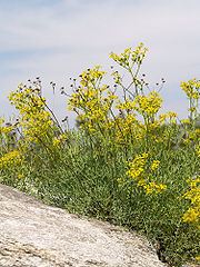
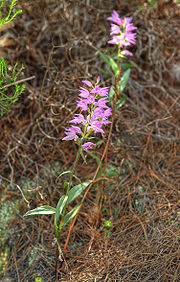
- Nomination Iris graminea flower. -- Ram-Man 04:01, 27 July 2007 (UTC)
- Promotion Yet another one in the series: QI Irises by Ram Man ;-) -- Lycaon 07:53, 27 July 2007 (UTC)
|
|
- Nomination Iris laevigata flower. -- Ram-Man 01:48, 27 July 2007 (UTC)
- Promotion Yet another one in the series: QI Irises by Ram Man ;-) -- Lycaon 07:53, 27 July 2007 (UTC)
|
|
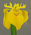
- Nomination Yellow Iris (Iris pseudacorus) flower. -- Ram-Man 03:44, 26 July 2007 (UTC)
- Promotion good isolation, clear focus Gnangarra 02:36, 27 July 2007 (UTC)
|
|
- Nomination A close-up of a brick Thegreenj 22:26, 25 July 2007 (UTC)
- Promotion It could perhaps be a little sharper, but it's enough for a QI. -- Ram-Man 12:00, 27 July 2007 (UTC)
|
|
- Nomination Tomato plant with three tomatoes of varying ripeness Thegreenj 21:44, 25 July 2007 (UTC)
- Promotion DoF on the tomatoes is perfect. -- Ram-Man 12:00, 27 July 2007 (UTC)
|
|
- Nomination Image of a red latch. -- moralist 21:40, 25 July 2007 (UTC)
- Decline I think it's beautiful, but the DoF should be higher. f/6.3 is too large an aperture. -- Ram-Man 12:01, 27 July 2007 (UTC)
|
|
|
- Nomination Wintersweet (Chimonanthus praecox) leaves. -- Ram-Man 14:35, 25 July 2007 (UTC)
- Promotion Good illustration, light is good, crisp focus. Lycaon 16:26, 26 July 2007 (UTC)
|
|
- Nomination Egg shaped puffball --Tony Wills 23:18, 24 July 2007 (UTC)
- Promotion Good composition and illumination under difficult lighting conditions. Lycaon 07:17, 25 July 2007 (UTC)
|
|
- Nomination The Slack River and the village of Ambleteuse (France) -- MJJR 20:20, 24 July 2007 (UTC)
- Promotion A bit flat light, but still ok for QI. Lycaon 20:34, 24 July 2007 (UTC)
|
|
- Nomination Pink Dahlia flower. -- Ram-Man 17:26, 24 July 2007 (UTC)
- Promotion DOF could've been a wee bit larger. Still certain QI. Lycaon 20:37, 24 July 2007 (UTC)
|
|
- Nomination Siberian Iris (Retouched). -- Ram-Man 15:11, 23 July 2007 (UTC)
- Promotion perfect exposure especially no underexposure of the violet. Well done background. --Ikiwaner 18:50, 24 July 2007 (UTC)
|
|
|
|
- Nomination Japanese Larch (Larix kaempferi). -- Ram-Man 14:52, 23 July 2007 (UTC)
- Promotion This is a pleasure to promote! The two objects are both equally sharp and nothing is sharp by coincidence. Only the composition could be slightly better. --Ikiwaner 18:37, 24 July 2007 (UTC)
|
|
- Nomination Naples, Florida: swamps. -- MJJR 19:54, 20 July 2007 (UTC)
- Promotion Not a very sharp lens but illustrative composition. --Ikiwaner 18:54, 24 July 2007 (UTC)
|
|
- Nomination Garden Locust (Acanthacris ruficornis ruficornis) at Tsumeb, Namibia -- Lycaon 07:33, 24 July 2007 (UTC)
- Promotion Sharp and detailed. -- Ram-Man 15:32, 24 July 2007 (UTC)
|
|
- Nomination Rock Hyrax (Procavia capensis) at Hardap Dam, Namibia -- Lycaon 07:33, 24 July 2007 (UTC)
- Promotion DoF is slightly shallow, but the face is sharp and the background is nice and blurry. -- Ram-Man 15:59, 24 July 2007 (UTC)
|
|
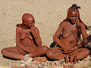
- Nomination A Himba village 15 km north of Opuwo, Nambia. Lycaon 08:11, 23 July 2007 (UTC)
- Promotion Contrast is a bit high, but it's clear and useful. -- Ram-Man 16:54, 24 July 2007 (UTC)
|
|
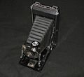
- Nomination Kodak No1 folding camera, view through the bellows. -- Adamantios 18:07, 22 July 2007 (UTC)
- Promotion Good detail and DoF. -- Ram-Man 15:25, 24 July 2007 (UTC)
|
|
- Nomination Ricinus communis -- MJJR 16:24, 22 July 2007 (UTC)
- Promotion Just good enough for a QI. -- Ram-Man 15:28, 24 July 2007 (UTC)
|
|
- Nomination Deerfield Beach (Florida, USA): the pier -- MJJR 16:24, 22 July 2007 (UTC)
- Promotion Sharp, good exposure, lack of CA. -- Ram-Man 15:31, 24 July 2007 (UTC)
|
|
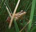
- Nomination Common Frog --JuliusR 07:57, 24 July 2007 (UTC)
- Promotion Nice light, sharp where it has to be. Lycaon 08:45, 24 July 2007 (UTC)
|
|
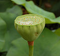
- Nomination Lotus (Nelumbo nucifera) seed head. -- Ram-Man 14:52, 23 July 2007 (UTC)
- Promotion Good sharpness, DOF and colours. --Lestat 19:52, 23 July 2007 (UTC)
|
|
- Nomination Lotus (Nelumbo nucifera) seed head. -- Ram-Man 14:52, 23 July 2007 (UTC)
- Promotion Good sharpness, DOF and colours. --Lestat 19:52, 23 July 2007 (UTC)
|
|
- Nomination Hydrangea macrophylla --Lestat 13:13, 21 July 2007 (UTC)
- Promotion It's perhaps not the sharpest possible, but it's good enough for a QI. -- Ram-Man 14:42, 23 July 2007 (UTC)
|
|
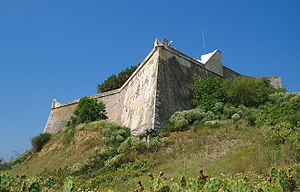
- Nomination San Miguel Castle at Almuñécar, Andalusia, Spain -- MJJR 19:31, 24 July 2007 (UTC)
- Decline Teveel ruis, vooral zichtbaar in de egale blauw lucht. (too noisy). Lycaon 20:37, 24 July 2007 (UTC)
|
|
- Nomination inside the Church of Gesù in Rome, Italy. Tone-mapped HDR image of 6 pictures. Alessio Damato
- Decline Ghost are tolerable giving the picture a mystic touch, but there are heavy distorsions and aberrations in the corners. There are to much details in this area to ignore this. --LC-de 08:29, 25 July 2007 (UTC)
|
|
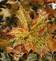
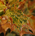
- Nomination Sawtooth Oak (Quercus acutissima) leaves. -- Ram-Man 15:10, 23 July 2007 (UTC)
- Decline Composition: centered leaf and cut leaf in the top right corner. Beautiful biikeh though --Ikiwaner 18:47, 24 July 2007 (UTC)
|
|
- Nomination Poppies (Papaver Rhoeas) -- MJJR 20:23, 22 July 2007 (UTC)
- Decline Quality is low. Image appears blurry and unsharp. -- Ram-Man 15:25, 24 July 2007 (UTC)
|
|
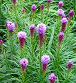
- Nomination Liatris spicata -- MJJR 16:24, 22 July 2007 (UTC)
- Decline Overexposure of the flower tips plus some color fringing. -- Ram-Man 15:28, 24 July 2007 (UTC)
|
|
|
- Nomination Perth Airport, and Perth CBD view from the Darling Scarp Gnangarra 10:26, 22 July 2007 (UTC)
- Decline Moire, hot air unsharpness... sorry. --Lestat 19:55, 23 July 2007 (UTC)
|
|
- Nomination Park in Olesko. --Lestat 13:13, 21 July 2007 (UTC)
- Decline Too high contrast from harsh lighting. Underexposed shadows, overexposed highlights on one of the stones. -- Ram-Man 15:04, 24 July 2007 (UTC)
|
|
- Nomination Home of Nicholas of Flüe --Ikiwaner 05:10, 23 July 2007 (UTC)
- Promotion One may argue that there is too much sky and too little foreground, and that the barn on the left should not be cropped. But I like the composition though, and according to the technical qualities it's a QI. And besides: it reminds me of a holiday over there in 1966... -- MJJR 09:42, 23 July 2007 (UTC)
|
|
- Nomination Anatomy of a Cat --Surachit 03:50, 23 July 2007 (UTC)
- Decline A bit oversimplified Lycaon 05:50, 23 July 2007 (UTC)
|
|
- Nomination Kodak No1 folding camera. -- Adamantios 18:07, 22 July 2007 (UTC)
- Decline Why use a black backround for a dark object? --Kolossos 21:28, 22 July 2007 (UTC)
|
|
- Nomination Headshot of the endemic Black-faced Impala (Aepyceros melampus petersi) in Etosha Namibia. Lycaon 12:52, 22 July 2007 (UTC)
- Promotion Certainly a QI! -- MJJR 20:34, 22 July 2007 (UTC)
|
|
- Nomination Are zebras white with black stripes, or black with white strips. Melanistic Equus quagga burchellii in Etosha Namibia. Lycaon 12:52, 22 July 2007 (UTC)
- Promotion The harvest of high quality pictures from Namibia is absolutely great... -- MJJR 20:34, 22 July 2007 (UTC)
I think I'm running out .. ;-( Lycaon 20:46, 22 July 2007 (UTC)
|
|
- Nomination Church in St Petersburg. George Shuklin 11:42, 22 July 2007 (UTC)
- Promotion The cropping is a little bit too tight, and the balconies on the right hand are rather disturbing (could you choose another point of view?). But technical quality is good and the subject itself is nicely represented. So for me it's a QI yet. -- MJJR 20:55, 22 July 2007 (UTC)
|
|
- Nomination Pyrite Thegreenj 22:14, 21 July 2007 (UTC)
- Promotion Nice studio work --Ikiwaner 05:14, 23 July 2007 (UTC)
|
|
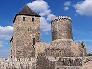
- Nomination Tower of castle in Kamieniec Ząbkowicki --Lestat 13:13, 21 July 2007 (UTC)
- Promotion Very 'classic' composition, nice lighting, good colors. -- MJJR 20:39, 22 July 2007 (UTC)
|
|
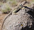
- Nomination Ground agama (Agama aculeata) at the petrified forest, east of Doro !Nawas, Namibia. Lycaon 07:59, 21 July 2007 (UTC)
- Promotion Clear illustration of lizard in habitat. -- Infrogmation 16:18, 22 July 2007 (UTC)
|
|
- Nomination Well, it's a grapefruit. -- Aleph 07:38, 21 July 2007 (UTC)
- Promotion Looks good on all accounts. Lycaon 07:49, 21 July 2007 (UTC)
|
|
- Nomination I am aware that this is an image one either likes because of the colors/lighting, or dislikes because of it; I am curious what you think. --Tsui 17:54, 20 July 2007 (UTC)
- Promotion I like it despite the lighting. You are right that the light does some odd things, but as an image, it still works. Not so sure about the next one. The lighting is a little more distracting. I think the image still works, but not as well as this one because the lighting is more severe than in this image. Ben Aveling 20:37, 20 July 2007 (UTC)
|
|
- Nomination It is not the sharpest, I know. But I like the expression. --Tsui 17:54, 20 July 2007 (UTC)
- Promotion now if she looking directly at the camera it'd be a FP, softness with people isnt necessarily a bad thing, in this case it complimentary to the expression. Gnangarra 13:01, 22 July 2007 (UTC)
|
|
- Nomination Coenonympha pamphilus --MichaD | Michael Apel 13:10, 20 July 2007 (UTC)
- Promotion Without a doubt. -- Ram-Man 14:21, 20 July 2007 (UTC)
|
|
- Nomination As the name proclaims: A second world war monument in a churchyard in Riga, --moralist 12:42, 20 July 2007 (UTC)
- Decline Reluctant decline, but the top is cut off. The overexposure police would probably argue about blown highlights as well. Otherwise this is excellent quality --MichaD | Michael Apel 13:25, 20 July 2007 (UTC)
|
|
- Nomination The elusive Damara Dik-dik in Etosha, Namibia -- Lycaon 11:51, 20 July 2007 (UTC)
- Promotion The foreground is a bit distracting again but quality is top notch --MichaD | Michael Apel 13:25, 20 July 2007 (UTC)
|
|
- Nomination An early morning breakfast by a Gemsbok in Etosha, Namibia -- Lycaon 11:51, 20 July 2007 (UTC)
- Promotion Superior quality (sharpness, colors, lighting) and at the same time a very nice composition. In my opinion certainly a valuable FPC. Kortom: zéér knap werk! -- MJJR 20:01, 20 July 2007 (UTC)
|
|
- Nomination Snoqualmie Falls by Jina Lee. -- Ram-Man 11:41, 20 July 2007 (UTC)
- Promotion Good composition with strong colours Gnangarra 13:14, 22 July 2007 (UTC)
 Question: Is the water not supposed to be white? Lycaon 07:35, 23 July 2007 (UTC) Question: Is the water not supposed to be white? Lycaon 07:35, 23 July 2007 (UTC)
Note the normal looking white clouds. This is not a WB issue or those would be wrong too. This is warm evening light. -- Ram-Man 11:41, 23 July 2007 (UTC)
Ok, it was just a question :-) Lycaon 11:47, 23 July 2007 (UTC)
|
|
|
- Nomination Church tower inside --Ikiwaner 18:14, 19 July 2007 (UTC)
- Decline all small issues but combined, use of the flash has flattened the stairs, windows cut and main window not square Gnangarra 13:19, 22 July 2007 (UTC)
|
|
- Nomination a gothic revival church tower from below --Ikiwaner 18:14, 19 July 2007 (UTC)
- Promotion Interesting positioning good use of perspective(one for the technical section), if LH edge had been only 1 section I'd say nominate at FP Gnangarra 13:21, 22 July 2007 (UTC)
|
|
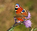
- Nomination European Peacock (Inachis io) --LC-de 16:27, 19 July 2007 (UTC)
- Promotion The DOF isn't perfect, but I think it's good enough. Ben Aveling 13:10, 20 July 2007 (UTC)
|
|
- Nomination male Banded Demoiselle (Calopteryx splendens) --LC-de 16:02, 19 July 2007 (UTC)
- Promotion Looks good to me. Ben Aveling 13:10, 20 July 2007 (UTC)
|
|
|
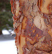
- Nomination Bark of the Austrian Pine. -- Ram-Man 13:58, 19 July 2007 (UTC)
- Promotion Simple composition well presented, flowers are nice but we need bark images Gnangarra 13:24, 22 July 2007 (UTC)
|
|
- Nomination American Winterberry fruit. -- Ram-Man 13:55, 19 July 2007 (UTC)
- Promotion Good light, colour and details. Lycaon 05:23, 20 July 2007 (UTC)
|
|
- Nomination Closup of a Damara Zebra at Etosha, Namibia. -- Lycaon 07:05, 19 July 2007 (UTC)
- Promotion Nice detail headshot. -- Ram-Man 12:01, 20 July 2007 (UTC)
|
|
- Nomination Angolan Giraffes having fun at Etosha, Namibia. -- Lycaon 07:05, 19 July 2007 (UTC)
- Promotion Good enough for a QI. -- Ram-Man 12:01, 20 July 2007 (UTC)
|
|
- Nomination Sheathed Woodtuft (Kuehneromyces mutabilis) in habitat --LC-de 20:06, 18 July 2007 (UTC)
- Promotion It's been a difficult decision (mainly about the rather cluttered composition), but in the end it's thumbs up. Lycaon 05:25, 20 July 2007 (UTC)
|
|
- Nomination Guînes (France): town hall -- MJJR 20:50, 17 July 2007 (UTC)
- Decline staat een beetje té scheef naar mijn zin. Rechttrekken en nog 'ns proberen. (building is tilted) Lycaon 05:29, 20 July 2007 (UTC)
|
|
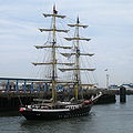
- Nomination The dutch brig Mercedes leaving the port of Boulogne (France) -- MJJR 20:50, 17 July 2007 (UTC)
- Promotion good composition, sharp, lighting could be better though --Ikiwaner 17:34, 19 July 2007 (UTC)
|
|
- Nomination Rock Ford plantation historical building. -- Ram-Man 14:36, 17 July 2007 (UTC)
- Decline good composition and lighting - please shoot raw and correct the strong colour aberrations! --Ikiwaner 17:34, 19 July 2007 (UTC)
CA is expected in these types of pictures, especially in corners, with almost all lenses, especially at the wide angle. RAW would make no difference. Even at 100%, the CA isn't that bad. -- Ram-Man 18:25, 19 July 2007 (UTC)
CA is just acceptable, but the CW tilt isn't. Lycaon 05:39, 20 July 2007 (UTC)
|
|
- Nomination Ornamental Onion. -- Ram-Man 14:32, 17 July 2007 (UTC)
- Promotion Ruminated a bit on the highlights. Good enough for QI though. Lycaon 05:41, 20 July 2007 (UTC)
|
|
- Nomination Catholic church in Worb, Switzerland. -- Selfnom: Jan.Kamenicek 11:58, 19 July 2007 (UTC)
- Decline Tilted, overexposed and fringed. Sorry. Lycaon 12:05, 19 July 2007 (UTC)
|
|
|
- Nomination All Gizah Pyramids in One shot, incredible detail at full resolution --Riclib 17:02, 18 July 2007 (UTC)
- Promotion Great picture! (sharpness and good lighting condition)--Beyond silence 17:14, 18 July 2007 (UTC)
|
|
- Nomination Yellow Mongoose (Cynictis penicillata) in Etosha, Namibia -- Lycaon 05:52, 18 July 2007 (UTC)
- Promotion High quality, just a bit distracting shadow --MichaD | Michael Apel 19:07, 18 July 2007 (UTC)
|
|
- Nomination The flower en:Fritillaria imperialis --moralist 21:32, 17 July 2007 (UTC)
- Decline Composition. Either crop more tightly to just focus on the center flowers, or less tightly, and include the others. Ben Aveling 10:06, 19 July 2007 (UTC)
|
|
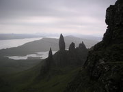
- Nomination Adršpašskoteplické skály --09:20, 16 July 2007 (UTC)
- Decline Not quite sharp enough for my taste. Ben Aveling 09:54, 19 July 2007 (UTC)
 Question: What kind of signature is it? --Beyond silence 09:33, 16 July 2007 (UTC) Someone probably signed using ~~~~~ instead of ~~~~. Regards, Ben Aveling 09:54, 19 July 2007 (UTC) Question: What kind of signature is it? --Beyond silence 09:33, 16 July 2007 (UTC) Someone probably signed using ~~~~~ instead of ~~~~. Regards, Ben Aveling 09:54, 19 July 2007 (UTC)
|
|
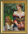
- Nomination Jacek Malczewski - Christ and the Samaritian Woman --09:20, 16 July 2007 (UTC)
- Decline The barrel distortion needs correction. And it needs a closer crop, lose the traces of the wall, maybe even lose the frame. Sorry Ben Aveling 09:54, 19 July 2007 (UTC).
 Question: What kind of signature is it? --Beyond silence 09:33, 16 July 2007 (UTC) Question: What kind of signature is it? --Beyond silence 09:33, 16 July 2007 (UTC)
|
|
- Nomination Southern Red Hartebeest (Alcelaphus buselaphus caama) in Etosha, Namibia -- Lycaon 05:52, 18 July 2007 (UTC)
- Promotion The foreground a bit distracting, but I think it can be QI from sharpness and good lighting condition.--Beyond silence 10:55, 18 July 2007 (UTC)
|
|
- Nomination Panorama over Riga --moralist 21:32, 17 July 2007 (UTC)
- Decline So really wide, but main part is so dark, and the picture don't to sharp. Sorry--Beyond silence 10:28, 18 July 2007 (UTC)
|
|
- Nomination Boulogne (France): Colonne de la Grande Armée -- MJJR 20:56, 17 July 2007 (UTC)
- Decline Napoleon is out of focus. Sorry. Ben Aveling
|
|
- Nomination Gargoyle at Château d'Amboise -- Ben Aveling 18:58, 17 July 2007 (UTC)
- Promotion Slightly underexposed, but sharp and balanced composition. -- MJJR 21:01, 17 July 2007 (UTC)
|
|
- Nomination Master Lock brand padlock -- Thegreenj 17:53, 17 July 2007 (UTC)
- Promotion Great techincal condition.--Beyond silence 18:14, 17 July 2007 (UTC)
|
|
- Nomination Kirby's Dropwing (Trithemis kirbyi) in Tsumeb,
Namibia. Lycaon 17:43, 17 July 2007 (UTC)
- Promotion Attractive color, sharp. -- Ram-Man 18:01, 17 July 2007 (UTC)
|
|
- Nomination Flowering Dogwood flower. -- Ram-Man 15:47, 17 July 2007 (UTC)
- Promotion Good techincal condition, a bit bad composition.--Beyond silence 18:23, 17 July 2007 (UTC)
|
|
- Nomination Grafted Cherry Tree by Jina Lee. -- Ram-Man 15:04, 17 July 2007 (UTC)
- Decline Subject too dark, and some noise.--Beyond silence 18:29, 17 July 2007 (UTC)
|
|
- Nomination Frozen peas by Jina Lee. -- Ram-Man 15:04, 17 July 2007 (UTC)
- Promotion Good techincal condition.--Beyond silence 18:25, 17 July 2007 (UTC)
|
|
- Nomination Broken Sand Dollar by Jina Lee. -- Ram-Man 15:04, 17 July 2007 (UTC)
- Promotion Good techincal condition.--Beyond silence 18:25, 17 July 2007 (UTC)
|
|
- Nomination Lotus (Nelumbo nucifera). -- Ram-Man 13:43, 17 July 2007 (UTC)
- Promotion Good colours, nice details. Crop is only a minor problem. Lycaon 14:08, 17 July 2007 (UTC)
|
|
- Nomination Japanese Larch needles (Larix kaempferi). -- Ram-Man 13:27, 17 July 2007 (UTC)
- Promotion Very illustrative. Technically good. Just a pity about the brown tips of some of the leaves... Lycaon 14:02, 17 July 2007 (UTC)
|
|
|
|
- Nomination Fulmer Falls downstream view. -- Ram-Man 13:24, 17 July 2007 (UTC)
- Decline Not on a par with your other nominations. Overexposed, blurry and fringed... Lycaon 14:06, 17 July 2007 (UTC)
|
|
|
- Nomination False Holly (Osmanthus heterophyllus). -- Ram-Man 13:20, 17 July 2007 (UTC)
- Promotion a bit distracting the part that is out of focus but still i think is enough for QI-LadyofHats 19:17, 17 July 2007 (UTC)
|
|
|
|
- Nomination English Ivy (Hedera helix) growing on a brick wall. -- Ram-Man 13:16, 17 July 2007 (UTC)
- Promotion No qualms. Good quality. (BTW, you can drop the most likely in the description). Lycaon 14:04, 17 July 2007 (UTC)
|
|
- Nomination Cave of Postojnska Jama (Think on difficult lighting conditions)--Beyond silence 06:28, 17 July 2007 (UTC)
- Decline still with lighting conditions much of the image is burn to black-LadyofHats 19:14, 17 July 2007 (UTC)
|
|
- Nomination Marble Hall in Silesian Seym --Lestat 09:20, 16 July 2007 (UTC)
- Promotion a bit anoying the shine of the lamps but hard to get it diferent-LadyofHats 19:14, 17 July 2007 (UTC)
|
|
- Nomination The castle in Olesko --Lestat 09:20, 16 July 2007 (UTC)
- Promotion is slightly overexposed but inside QI lines-LadyofHats 19:14, 17 July 2007 (UTC)
|
|
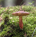
- Nomination Boletus chrysenteron --LC-de 12:57, 15 July 2007 (UTC)
- Promotion I think it's a QI despite the streaming background light. -- Ram-Man 17:35, 17 July 2007 (UTC)
|
|
- Nomination Chimney in Crespi d'Adda --Luigi Chiesa 22:56, 13 July 2007 (UTC)
- Promotion Quality is good. Reasons to decline are all FP-only reasons. -- Ram-Man 17:37, 17 July 2007 (UTC)
|
|
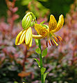
- Nomination Hanson's Lily (Lilium hansonii). -- Ram-Man 12:22, 10 July 2007 (UTC)
- Promotion Nice sharp clarity, individual features of the flower are clearly identifiable Gnangarra 04:49, 14 July 2007 (UTC)-- still lighting could improve. -LadyofHats 19:02, 17 July 2007 (UTC)
|
|
- Nomination The Greifensteine, a formation of granite rocks, near Ehrenfriedersdorf, Germany --LC-de 22:05, 16 July 2007 (UTC)
- Promotion There are overexposed parts, and the tree at forgrnd is a bit distracting, but techicaly enough to QI.--Beyond silence 06:31, 17 July 2007 (UTC)
|
|
- Nomination Summer generation of Araschnia levana --MichaD | Michael Apel 21:40, 16 July 2007 (UTC)
- Promotion Almost perfect focus, pity about the wing damage. QI worthy. Lycaon 21:52, 16 July 2007 (UTC)
|
|
- Nomination Blue Wildebeest Connochaetes taurinus north of Namutoni, Etosha, Namibia. -- Lycaon 20:02, 16 July 2007 (UTC)
- Promotion Accaptable technical condition - good lighting on the subject. --Beyond silence 06:33, 17 July 2007 (UTC)
|
|
- Nomination A rare Ludwig's Bustard Neotis ludwigii near Palmwag, Namibia. -- Lycaon 20:02, 16 July 2007 (UTC)
- Promotion A bit noisy and hard light but definitely good enough
 CommentNeed to be signatured!--Beyond silence 06:15, 17 July 2007 (UTC) CommentNeed to be signatured!--Beyond silence 06:15, 17 July 2007 (UTC)  Comment Oops, that was me --MichaD | Michael Apel 11:21, 17 July 2007 (UTC) Comment Oops, that was me --MichaD | Michael Apel 11:21, 17 July 2007 (UTC)
|
|
- Nomination Sounder of wild boar (sow, her piglets and a female from her last year offspring) --LC-de 18:48, 16 July 2007 (UTC)
- Promotion I would appreciate some location info. Lycaon 20:02, 16 July 2007 (UTC)
Done --LC-de 21:55, 16 July 2007 (UTC)
Good enough result for difficult (and dark) lighting conditions. (BTW what happened to the exif?) Lycaon 22:28, 16 July 2007 (UTC)
|
|
- Nomination Barn Swallow (Hirundo rustica) --LC-de 12:45, 15 July 2007 (UTC)
- Promotion Good sharpness and lighting on subject. --Beyond silence 18:20, 16 July 2007 (UTC)
|
|
- Nomination A big Mall in Stuttgart, Bad Cannstadt --Stefan-Xp 21:16, 14 July 2007 (UTC)
- Promotion I've seen nicer architecture but the photography and lightening are very good. --Ikiwaner 23:43, 16 July 2007 (UTC)
|
|
- Nomination Armenian Cathedral in Lviv. --Lestat 09:20, 16 July 2007 (UTC)
- Promotion Accaptable technical condition - good lighting on the subject.--Beyond silence 09:36, 16 July 2007 (UTC)
|
|
- Nomination Guard tower in castle in Malbork. --Lestat 09:20, 16 July 2007 (UTC)
- Promotion Accaptable technical condition - good lighting on the subject.--Beyond silence 09:36, 16 July 2007 (UTC)
|
|
- Nomination Greater kudu - Tragelaphus strepsiceros. Lycaon 13:10, 15 July 2007 (UTC)
- Promotion Good technical condition - sharpness and lighting on subject.--Beyond silence 07:58, 16 July 2007 (UTC)
|
|
- Nomination Black-backed jackal - Canis mesomelas. Lycaon 13:10, 15 July 2007 (UTC)
- Promotion Good technical condition - sharpness and lighting on subject.--Beyond silence 07:58, 16 July 2007 (UTC)
|
|
- Nomination A Sundial @ the Carl-Zeiss-Planetarium in Stuttgart --Stefan-Xp 21:16, 14 July 2007 (UTC)
- Promotion Good sharpness and lighting condition on subject.--Beyond silence 03:46, 15 July 2007 (UTC)
|
|
- Nomination A green polo 6N --Stefan-Xp 21:16, 14 July 2007 (UTC)
- Promotion Acceptable technical condition and composition for subject.--Beyond silence 08:06, 15 July 2007 (UTC)
|
|
- Nomination Petunia Flower --Digon3 talk 13:23, 14 July 2007 (UTC)
- Promotion Good composition and I think technicaly acceptable.--Beyond silence 03:36, 15 July 2007 (UTC)
|
|
- Nomination Berlin Mitte panorama. --Adamantios 12:57, 14 July 2007 (UTC)
- Promotion Good technical condition, good lighting and sharpness. --Beyond silence 13:57, 14 July 2007 (UTC)
|
|
- Nomination View of the monastery of Dragomirna in Bucovina, north Romania --Alessio Damato 13:51, 8 July 2007 (UTC)
- Promotion Good image, very nice colours. --Lestat 18:31, 14 July 2007 (UTC)
|
|
- Nomination A simple throw pillow --Scrumshus 05:22, 8 July 2007 (UTC)
- Promotion i sometimes really have problems to qualify this images. the subject is plain boring the composition is straight foward and the background dont help it at all. please try making your images a bit more dinamic. otherwise is an image noone would want to spend more than a second looking at-LadyofHats 19:47, 14 July 2007 (UTC)
|
|
- Nomination Sunset in Recife, Brazil. Christof01 20:44, 15 July 2007 (UTC)
- Decline Sun looks very distracting.--Beyond silence 02:40, 16 July 2007 (UTC)
|
|
- Nomination Vanda coerulea, a type of orchid. Scrumshus 18:24, 14 July 2007 (UTC)
- Decline Distracting shadow on whol subject.--Beyond silence 03:38, 15 July 2007 (UTC)
|
|
- Nomination Wild Lantana Camara. --Digon3 talk 13:23, 14 July 2007 (UTC)
- Decline centralise composition, too much backgound area. Gnangarra 03:54, 15 July 2007 (UTC)
|
|
- Nomination Roof tip of Berliner philharmonie. --Adamantios 12:57, 14 July 2007 (UTC)
- Decline Composition is interesting, but I think this small piece of roof don't present high value from the subject. But if we don't think about it, the whole object in shadow, so tehnicaly distracting. --Beyond silence 13:57, 14 July 2007 (UTC)
|
|
- Nomination A mother mallard with her babies (Anas platyrhynchos) Scrumshus 03:53, 14 July 2007 (UTC)
- Decline So the subject is really dark as distracting, composition a bit weak too. --Beyond silence 14:10, 14 July 2007 (UTC)
|
|
- Nomination A creche of Canada Geese (Branta canadensis) --Scrumshus 05:22, 8 July 2007 (UTC)
- Decline poor composition, interesting subject if only they were swimming towards the camera or even across anything but away from the lens Gnangarra 13:40, 15 July 2007 (UTC)
|
|
- Nomination A Pigeon in Chicago (Columba livia domestic) Scrumshus 03:53, 14 July 2007 (UTC)
- Decline Dark, poor composition and value. --Beyond silence 04:30, 14 July 2007 (UTC)
|
|
- Nomination Hans-Gert Pöttering, President of the European Parliament. -- Aleph 19:45, 13 July 2007 (UTC)
- Promotion Enough high quality by lighting and sharpness. --Beyond silence 04:04, 14 July 2007 (UTC)
|
|
- Nomination Yellow Coneflower with a bee. -- Ram-Man 12:26, 10 July 2007 (UTC)
- Decline becouse many of the flower petals are out of focus there is not a real diference between those infront and those behind. -LadyofHats 16:01, 13 July 2007 (UTC)
|
|
- Nomination Nihil. --Lestat 19:23, 8 July 2007 (UTC)
- Decline Too dark, hard to see what presents the pic's value. --Beyond silence 16:30, 13 July 2007 (UTC)
|
|
- Nomination The tower of the orthodox trinity church in Sighisoara, Romania --Alessio Damato 13:51, 8 July 2007 (UTC)
- Promotion There was a bit to much shadow, I improved it, now good for QI.--Beyond silence 16:22, 13 July 2007 (UTC)
|
|
- Nomination An opening to a bikepath/creek --Scrumshus 05:22, 8 July 2007 (UTC)
- Decline Not enough definition, possibly from too much detail in the landscape but not enough resolution (it's 5MP!) in the camera to capture it. The contrasty light accentuates this. Maybe it was just oversharpened in software. -- Ram-Man 12:36, 13 July 2007 (UTC)
|
|
- Nomination Church of "Nossa Senhora Auxiliadora", in Cuiabá. --Mateus Hidalgo 03:03, 7 July 2007 (UTC)
- Decline ,uch detail lost in the statue duew overexposure-LadyofHats 09:42, 14 July 2007 (UTC)
|
|
- Nomination Church of Our Lady of the Rosary and Saint Benedict, in Cuiabá. --Mateus Hidalgo 03:03, 7 July 2007 (UTC)
- Promotion not a fan from tilted compositions but it is a good foto-LadyofHats 09:42, 14 July 2007 (UTC)
|
|
- Nomination Cane Cholla Blossom --Skoch3 07:12, 13 July 2007 (UTC)
- Promotion Stuff that has to be in focus, is so. Nicely done: QI. Lycaon 08:04, 13 July 2007 (UTC)
|
|
- Nomination a bottle of home-made limoncello, with removed background. Click on the picture to see the original version. Alessio Damato 07:08, 12 July 2007 (UTC)
- Decline overexposed, noisy and too saturated-LadyofHats 17:41, 12 July 2007 (UTC)
|
|
- Nomination Icy Cactaceae, shot in the Himalayas --Greatestprateek 15:15, 12 July 2007 (UTC)
- Decline Cactaceae are endemic to the Americas (mainly middle/south). Lycaon 17:27, 12 July 2007 (UTC)
|
|
- Nomination Image of nudibranch Chromodoris willani. --Jnpet 10:01, 12 July 2007 (UTC)
- Decline Poor quality (focus, noise). Lycaon 17:27, 12 July 2007 (UTC)
|
|
- Nomination Ayamonte (Spain): street in the old town -- MJJR 20:55, 3 July 2007 (UTC)
- Decline The subject just a bit poor, not present a high value. The composition is not help to show that can be interesting in this street, and a bit to dark. --Beyond silence 09:22, 13 July 2007 (UTC)
|
|
- Nomination animal cell structure -- LadyofHats 10:40, 22 June 2007 (UTC)
- Promotion Very well made diagramm, just the different sizes of the arrow-ends are a little distracting. Other opinions? --Simonizer 14:51, 27 June 2007 (UTC) arrows heads are the same size the variance is due to angle of the lines Gnangarra 13:59, 8 July 2007 (UTC)you know guys you could have told me before that the text overlaped with the arrows.. anyway it is fixed now-LadyofHats 16:00, 12 July 2007 (UTC)
|
|
- Nomination Tulip Tree underside closeup. -- Ram-Man 13:31, 10 July 2007 (UTC)
- Promotion I like it. Good DOF ;-) next time I want to see stomata... Lycaon 19:20, 11 July 2007 (UTC)
|
|
- Nomination Pickerelweed Flowers. --Digon3 talk 19:30, 8 July 2007 (UTC)
- Promotion The composition isn't FP-worthy, but it's sharp and clear. -- Ram-Man 12:13, 11 July 2007 (UTC)
|
|
- Nomination Unidentified Red Flowers, possibly a geranium. --Digon3 talk 19:30, 8 July 2007 (UTC)
- Decline Overexposed, the reds are clipping. It would be nice if identified too. -- Ram-Man 11:33, 12 July 2007 (UTC)
|
|
- Nomination "Green salon" with art gallery in museum in Bielsko-Biała (Poland). --Lestat 19:23, 8 July 2007 (UTC)
- Promotion The lighting is borderline, but it looks ok to me. -- Ram-Man 11:34, 12 July 2007 (UTC)
|
|
- Nomination Cellar of Westfield winery -- Gnangarra 13:48, 8 July 2007 (UTC)
- Promotion Nice subject matter. -- Ram-Man 11:38, 12 July 2007 (UTC)
|
|
- Nomination Elephant Beetle (Megasoma elephas). -- Ram-Man 12:22, 10 July 2007 (UTC)
- Promotion Great picture, QI --LC-de 13:57, 10 July 2007 (UTC)
|
|
- Nomination Hotel with artwork in Neuchâtel --Ikiwaner 22:35, 9 July 2007 (UTC)
- Promotion Good composition, nice sky; white parts almost overexposed, but that's unavoidable with such a great contrast. Certainly a QI! -- MJJR 20:56, 10 July 2007 (UTC)
|
|
- Nomination An extreme case of mind-boggling regular and wrong-way concurrencies win60 02:25, 10 July 2007 (UTC)
- Decline Interesting picture, but 166 KB is far too small for a QI. -- MJJR 21:03, 10 July 2007 (UTC)
|
|
- Nomination Antique coin purse --sanjay_ach 00:52, 5 July 2007 (UTC)sanjay_ach
- Promotion Looks great to me. -- Ram-Man 13:55, 10 July 2007 (UTC)
|
|
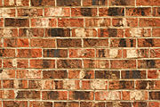
- Nomination I like bricks... Thegreenj 04:03, 4 July 2007 (UTC)
- Promotion More bricks. I think they're rather trivial and boring, but it has the technical quality required. -- Ram-Man 13:47, 10 July 2007 (UTC)
|
|
- Nomination Ayamonte (Spain): Muelle de Portugal -- MJJR 20:55, 3 July 2007 (UTC)
- Promotion Boring, but high enough quality. -- Ram-Man 13:47, 10 July 2007 (UTC)
|
|
- Nomination Ayamonte (Spain): General view of the northern part of the town and the San Salvador church -- MJJR 20:55, 3 July 2007 (UTC)
- Promotion Overexposure: primary subject matter has washed out detail. -- Ram-Man 13:47, 10 July 2007 (UTC)
|
|
- Nomination Spiderwort (Tradescantia obiensis). --Digon3 talk 14:34, 3 July 2007 (UTC)
- Promotion It's simplistic and sharp enough. -- Ram-Man 13:36, 10 July 2007 (UTC)
|
|
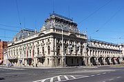
- Nomination Izrael Poznański's Palace in Łódź (Poland). --Lestat 21:34, 6 July 2007 (UTC)
- Decline Sightly overexposed, but too much for QI. Moreover, use only ASCII characters in filenames, please. Alessio Damato 08:34, 11 July 2007 (UTC)
|
|
- Nomination Gold Mine in Złoty Stok. --Lestat 21:34, 6 July 2007 (UTC)
- Decline Heavily overexposed. Alessio Damato 08:34, 11 July 2007 (UTC)
|
|
- Nomination Upper Silesian Ethnographic Park. --Lestat 21:34, 6 July 2007 (UTC)
- Decline The sky is overexposed. I don't like the shadow in the foreground, too Alessio Damato 08:34, 11 July 2007 (UTC)
|
|
- Nomination Blue flax flower --Skoch3 06:14, 6 July 2007 (UTC)
- Decline The DOF is perfect, but unfortunately it's overexposed... try to re-take it, if you can. Alessio Damato 08:34, 11 July 2007 (UTC)
|
|
- Nomination Kori Bustard (Ardeotis kori) in Etosha, Namibia -- Lycaon 12:12, 6 July 2007 (UTC)
- Promotion Easy QI. -- Ram-Man 14:01, 10 July 2007 (UTC)
|
|
- Nomination Steenbok (Raphicerus campestris) in Northern Namibia -- Lycaon 11:51, 6 July 2007 (UTC)
- Promotion Very nice. A bit noisy, but acceptable at 2MP. The view of the leg is obstructed, but I think it's ok in the corner. -- Ram-Man 14:01, 10 July 2007 (UTC)
|
|
- Nomination Woolly Foxglove (Digitalis lanata) --LC-de 20:20, 5 July 2007 (UTC)
- Promotion Good picture Lycaon 20:34, 8 July 2007 (UTC)
|
|
- Nomination Avaceratops reconstruction--LadyofHats 16:08, 4 July 2007 (UTC)
- Promotion Well executed (as usual). Lycaon 10:04, 9 July 2007 (UTC)
|
|
- Nomination Ayamonte (Spain): Capilla de San Antonio -- MJJR 21:00, 3 July 2007 (UTC)
- Promotion Good artistic composition that make the fore and the background useful. Good sharpness.
|
|
- Nomination TN Mitsubishi Magna -- Gnangarra 07:11, 9 July 2007 (UTC)
- Decline Poorly cropped. The front is the face of the car and cropping there would result in somewhat strange compositions. --LC-de 08:35, 9 July 2007 (UTC)
|
|
- Nomination User Ejdzej. --Lestat 19:23, 8 July 2007 (UTC) No encyclopedic value, no desription in English, bad angle --Orlovic (talk) 20:26, 8 July 2007 (UTC)
- Decline
|
|
- Nomination Church of Our Lady of "Bom Despacho", in Cuiabá. --Mateus Hidalgo 03:03, 7 July 2007 (UTC)
- Decline Tree. --Lestat 19:25, 8 July 2007 (UTC)
|
|
- Nomination Yellow Lantana Camara. --Digon3 talk 14:37, 6 July 2007 (UTC)
- Decline Very blurry/out-of-focus. -- Ram-Man 14:01, 10 July 2007 (UTC)
|
|
- Nomination Seattle Skyline at dusk.--Cacophony 04:00, 1 July 2007 (UTC)
- Promotion
 Comment Truly a magnificent shot, but the left-hand-side is suffering from slight slope to the right. Could this be fixed before we promote it? –Dilaudid 08:04, 1 July 2007 (UTC) Comment Truly a magnificent shot, but the left-hand-side is suffering from slight slope to the right. Could this be fixed before we promote it? –Dilaudid 08:04, 1 July 2007 (UTC)
 Info: I straightened it and reuploaded. Cacophony 21:58, 1 July 2007 (UTC) Neat! –Dilaudid 09:24, 4 July 2007 (UTC) Info: I straightened it and reuploaded. Cacophony 21:58, 1 July 2007 (UTC) Neat! –Dilaudid 09:24, 4 July 2007 (UTC)
|
|
- Nomination Rose chafer (Torynorrhina). --Makro Freak 17:30, 30 June 2007 (UTC)
- Promotion Fantastic. –Dilaudid 08:01, 1 July 2007 (UTC)
|
|
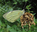
- Nomination A Pieris Brassicae (Large White) with closed wings. --S Sepp 14:51, 30 June 2007 (UTC)
- Promotion Well done. Cacophony 06:40, 3 July 2007 (UTC)
|
|
- Nomination Wild Lantana Camara. --Digon3 talk 14:37, 6 July 2007 (UTC)
- Decline Unsharp. More DoF needed. Smaller aperture than f/2.8 required. -- Ram-Man 14:01, 10 July 2007 (UTC)
|
|
Sedum acre LC0060.jpg
- Nomination Wallpepper (Sedum acre) --LC-de 17:45, 5 July 2007 (UTC)
- Decline The blurry foreground elements in the center of the picture hurts an otherwise great picture. -- Ram-Man 13:55, 10 July 2007 (UTC)
|
|
- Nomination Collared Lizard --Skoch3 06:10, 5 July 2007 (UTC)
- Decline Too shallow DoF at f/5.6. The body of the lizard is blurred or out-of-focus. -- Ram-Man 13:55, 10 July 2007 (UTC)
|
|
- Nomination Yorkshire Terrier --Przykuta 11:46, 4 July 2007 (UTC)
- Decline Unsharp and blurry. Reds look clipped. -- Ram-Man 13:51, 10 July 2007 (UTC)
|
|
- Nomination Spices in Morocco. —Bkell (talk) 05:42, 4 July 2007 (UTC)
- Decline The text on the labels is unsharp and distracting. -- Ram-Man 13:47, 10 July 2007 (UTC)
|
|
- Nomination Impatiens walleriana. Thegreenj 04:03, 4 July 2007 (UTC)
- Decline Poor lighting and shallow DoF. -- Ram-Man 13:47, 10 July 2007 (UTC)
|
|
- Nomination Ayamonte (Spain): International bridge on the Río Guadiana -- MJJR 21:00, 3 July 2007 (UTC)
- Decline Composition: Foreground distracts. Background is too hazy. -- Ram-Man 13:47, 10 July 2007 (UTC)
|
|
- Nomination Lantana (Lantana camaraflower) --Digon3 talk 15:13, 3 July 2007 (UTC)
- Decline Too shallow DoF makes the topmost flowers unsharp. -- Ram-Man 13:36, 10 July 2007 (UTC)
|
|
- Nomination Wild Petunia (Ruellia caroliniensis). --Digon3 talk 14:34, 3 July 2007 (UTC)
- Decline The picture is a little muted. It needs to be levels adjusted such that it is a little brighter. -- Ram-Man 13:36, 10 July 2007 (UTC)
|
|
- Nomination Canal in Venice -- MJJR 20:22, 2 July 2007 (UTC)
- Decline underexposed it misses contrast. rather dull composition -LadyofHats 10:04, 9 July 2007 (UTC)
|
|
- Nomination The lagoon of Venice at sunset -- MJJR 20:22, 2 July 2007 (UTC)
- Decline overexposed-LadyofHats 10:04, 9 July 2007 (UTC)
|
|
- Nomination A vector CD.--Kulshrax 23:21, 30 June 2007 (UTC)
- Decline
Althgouh simple, it's faultless and very useful. –Dilaudid 08:01, 1 July 2007 (UTC) I'll take that back, since it seems the reflections are embedded as raster, in which case I think the picture shouldn't be promoted. –Dilaudid 20:48, 1 July 2007 (UTC)
|
|
- Nomination This picture has been hanging for some time in my page, mainly for sentimental reasons. Today I looked at it with a more "technical" eye and I realized that the quality might be good enough for QI. What do you think? - Alvesgaspar 23:11, 29 June 2007 (UTC)
- Decline Bad colours, noisy bckgr, main subject unsharp. I like cats like that one --Orlovic (talk) 12:17, 30 June 2007 (UTC)
|
|
- Nomination Euproctis similis --Przykuta 11:46, 4 July 2007 (UTC)
- Decline It is a neat picture, but out of focus, unfortunately--Skoch3 03:06, 8 July 2007 (UTC)
|
|
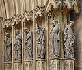
- Nomination Erfurt Cathedral, Germany --Kolossos 10:43, 1 July 2007 (UTC)
- Promotion Is an excellent photo, only concern is that it is borderline on resolution. Given the subject of the photo (many individual faces), higher resolution is desirable. What do others think?--Skoch3 03:27, 7 July 2007 (UTC)
Attention: I uploaded the image now with a higher resolution. Kolossos 11:05, 7 July 2007 (UTC)
*Higher resolution looks great and definitely QI in my opinion. If you have even higher resolution, please upload!--Skoch3 20:37, 7 July 2007 (UTC)
|
|
- Nomination Springbok (Antidorcas marsupialis) in Etosha, Namibia -- Lycaon 13:56, 6 July 2007 (UTC)
- Promotion Absolutely a QI, razor sharp, although some people may find the background 'disturbing' / Absoluut een QI, letterlijk haar-scherp! De volgens sommigen misschien 'storende achtergrond' doet daar niets van af. Schitterend beeld! -- MJJR 19:12, 6 July 2007 (UTC)
|
|
- Nomination Red-headed Finch (Amadina erythrocephala) at Sossusvlei, Namibia -- Lycaon 13:49, 6 July 2007 (UTC)
- Promotion Lovely! -- MJJR 19:12, 6 July 2007 (UTC)
|
|
- Nomination English Setter --Przykuta 11:46, 4 July 2007 (UTC)
- Promotion Rather light (only 1 MB), but yet a good picture! -- MJJR 19:38, 6 July 2007 (UTC)
|
|
- Nomination Daylily in the rain. -- Ram-Man 11:52, 3 July 2007 (UTC)
- Promotion Just fine; the version with flash is sharper, but otherwise not better than this one. -- MJJR 19:28, 6 July 2007 (UTC)
|
|
- Nomination Hydrangea macrophylla -- MJJR 20:15, 25 June 2007 (UTC)
- Promotion Quality Image! --Simonizer 14:10, 27 June 2007 (UTC) *You should nominate this at FPC. --Digon3 talk 20:10, 27 June 2007 (UTC) ** The crop is not nice --Makro Freak 17:41, 30 June 2007 (UTC)**I notice that now. You should definitly retake the subject and try for better composition, its a great picture. --Digon3 talk 17:02, 2 July 2007 (UTC) **Retake is not possible, as the flowers in my garden were overblown in the mean time... -- MJJR 19:47, 6 July 2007 (UTC)
|
|
- Nomination Biebrza river in Burzyn, Poland Wojsyl 18:52, 5 July 2007 (UTC)
- Decline Size! Please read the guidelines --Simonizer 20:03, 5 July 2007 (UTC)
|
|
- Nomination Homeless in Ontario --WayneRay 17:54, 4 July 2007 (UTC)WayneRay
- Decline Too blurry. --Florian Prischl 16:36, 5 July 2007 (UTC)
|
|
- Nomination Echeveria pulvinata oliver --WayneRay 17:41, 4 July 2007 (UTC)WayneRay
- Decline Strange exposure and very, very blue. -- Ram-Man 17:44, 5 July 2007 (UTC)
|
|
- Nomination Echeveria glauca --WayneRay 17:48, 4 July 2007 (UTC)WayneRay
- Decline Too dark. --Florian Prischl 16:36, 5 July 2007 (UTC)
|
|
- Nomination A water castle in germany --Kolossos 10:43, 1 July 2007 (UTC)
- Decline Nice picture, but it seems underexposed and/or oversaturated to me. Need another opinion. -- MJJR 21:18, 3 July 2007 (UTC) yep, underexposed --Simonizer 11:17, 6 July 2007 (UTC)
|
|
- Nomination Abbey in Wunstorf, Germany. --Dschwen 20:27, 28 June 2007 (UTC)
- Decline
 Info: small dust speck right of rooftop in the sky -- Klaus with K 16:36, 29 June 2007 (UTC) Oversaturated green colours --Simonizer 11:08, 6 July 2007 (UTC) Info: small dust speck right of rooftop in the sky -- Klaus with K 16:36, 29 June 2007 (UTC) Oversaturated green colours --Simonizer 11:08, 6 July 2007 (UTC)
|
|
|
|
- Nomination Cornflowers (Centaurea cyanus) --LC-de 19:47, 28 June 2007 (UTC)
- Decline Good quality, but weird and unclear compostion --Simonizer 11:05, 6 July 2007 (UTC)
|
|
- Nomination Misumena vatia with pray Apis mellifera --MichaD | Michael Apel 07:46, 5 July 2007 (UTC)
- Promotion Could you please wash the pollen off the bee and then retake the photo? Ha ha, j/k, Wow, this photo is incredible, definitely high quality...would love to know how you captured it.--Skoch3 08:01, 5 July 2007 (UTC)
|
|
- Nomination Dresden, Germany at night --Kolossos 10:43, 1 July 2007 (UTC)
- Promotion A little lack of sharpness at the left side. Black edge at the lower left corner. Perhaps you can slightly crop the left side of the image? Otherwise a good picture! -- MJJR 21:14, 3 July 2007 (UTC)
|
|
- Nomination Typewriter detail from 1923 --Kolossos 10:43, 1 July 2007 (UTC)
- Decline Good concept and fine detail, but the angle of the shot doesn't show enough of the typewriter. More reviews needed! Greatestprateek 13:03, 3 July 2007 (UTC)
Info: more opinions can be found on Featured picture candidate --Kolossos
|
|
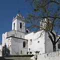
- Nomination Santiago church, Tavira (Portugal) -- MJJR 20:51, 27 June 2007 (UTC)
- Decline overexposed-LadyofHats 11:33, 4 July 2007 (UTC)
|
|
- Nomination Ring-tailed lemur --Chris_huh 11:36, 26 June 2007 (UTC)
- Decline *
 Question: are those the right colors? i have this impression the image has too much green or yellow in it-LadyofHats 14:59, 27 June 2007 (UTC) - It was the original photo, but yeah it does look like its got too much green so i have reduced the green in the photo. Chris_huh 15:10, 27 June 2007 (UTC)* unfortunaly it means now the pictue is overexposed -LadyofHats 11:07, 4 July 2007 (UTC) Question: are those the right colors? i have this impression the image has too much green or yellow in it-LadyofHats 14:59, 27 June 2007 (UTC) - It was the original photo, but yeah it does look like its got too much green so i have reduced the green in the photo. Chris_huh 15:10, 27 June 2007 (UTC)* unfortunaly it means now the pictue is overexposed -LadyofHats 11:07, 4 July 2007 (UTC)
|
|
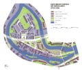
- Nomination Wrocław, Kępa Mieszczańska (Bürgerwerder) island on the Odra River, 2006 Przykuta 12:04, 21 June 2007 (UTC)
- Decline oops can someone help me i dont find this image..-LadyofHats 09:28, 23 June 2007 (UTC)
*I guess that Przykuta meant this image. Herr Kriss 15:36, 25 June 2007 (UTC)too much information in to few space, too similar colors dificult the reading of the lines, the text is to tight and hard to read (recognise) in some parts-LadyofHats 10:51, 4 July 2007 (UTC)
|
|
- Nomination It's, well... a brick. Thegreenj 21:05, 2 July 2007 (UTC)
- Promotion Well shot, maybe a bit overexposed. Better than the photo of the wall, mainly because it is larger. --Florian Prischl 07:48, 3 July 2007 (UTC)
|
|
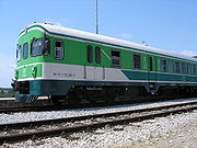
- Nomination Slovenian 711 series train --Orlovic (talk) 20:34, 2 July 2007 (UTC)
- Promotion Not as good as the pictures of the blue train of June 29. You should crop the image a little bit on the right. Please make your pictures heavier: 2MB if possible... But nevertheless, I think it's just good enough for a QI. -- MJJR 20:53, 2 July 2007 (UTC)
Cropped. I don't know how to make them heavier now. --Orlovic (talk) 21:47, 2 July 2007 (UTC)
|
|
- Nomination Spiderwort (Tradescantia obiensis). --Digon3 talk 17:04, 2 July 2007 (UTC)
- Decline One of the flower petals sticks up out of the focus plane and is distracting. Otherwise very nice. -- Ram-Man 12:07, 3 July 2007 (UTC)
|
|
- Nomination Spiderwort (Tradescantia obiensis). Low DOF was intentional. --Digon3 talk 17:04, 2 July 2007 (UTC)
- Promotion This is quite beautiful. -- Ram-Man 12:07, 3 July 2007 (UTC)
|
|
- Nomination European tree frog --Wojsyl 16:23, 2 July 2007 (UTC)
- Decline
Size is <2MP Cacophony 23:03, 2 July 2007 (UTC)
|
|
- Nomination Lake Mansarovar and the Tibetan Himalayas --Greatestprateek 15:52, 2 July 2007 (UTC)
- Decline Overexposed and oversaturated. --Digon3 talk 19:01, 2 July 2007 (UTC)
|
|
- Nomination Yaquina Bay Bridge center span --Cacophony 07:09, 2 July 2007 (UTC)
- Promotion Good picture --Simonizer 10:31, 3 July 2007 (UTC)
|
|
- Nomination Pair of Yellow Coneflowers (Echinacea paradoxa) without a bee. -- Ram-Man 13:43, 29 June 2007 (UTC)
- Promotion Good DoF, good colors, good composition, nicely blurred background. -- MJJR 20:41, 2 July 2007 (UTC)
|
|
- Nomination Pair of Yellow Coneflowers (Echinacea paradoxa) with a bee. -- Ram-Man 13:43, 29 June 2007 (UTC)
- Promotion I prefer the one without the bee, but of course it's a good picture too. -- MJJR 20:41, 2 July 2007 (UTC)
|
|
- Nomination A Slovenian multiple unit train --Orlovic (talk) 12:24, 29 June 2007 (UTC)
- Promotion I like trains and good photographs of trains. And this is a good one, although rather small (less than 1MB). Nice background with the clouds! -- MJJR 20:41, 2 July 2007 (UTC)
|
|
- Nomination A Slovenian multiple unit train --Orlovic (talk) 12:24, 29 June 2007 (UTC)
- Promotion This is a nice one too. -- MJJR 20:41, 2 July 2007 (UTC)
|
|
- Nomination Barley in the evening sun. --Dschwen 19:31, 28 June 2007 (UTC)
- Promotion Simplistic and pretty. No major faults. -- Ram-Man 11:55, 3 July 2007 (UTC)
|
|
- Nomination A new version of the crocodile--AngMoKio 19:17, 28 June 2007 (UTC)
- Decline Unlike FP where the unnatural concrete background would be bad, this isn't such a big deal, except that the dark spot is exceedingly distracting. -- Ram-Man 11:57, 3 July 2007 (UTC)
|
|
- Nomination Perfect Lorikeet --Cacophony 01:00, 2 July 2007 (UTC)
- Decline Very noisy. Try to remove noise. ---donald- 09:58, 2 July 2007 (UTC)
|
|
- Nomination Juvenile Black Redstart. Wojsyl 19:33, 1 July 2007 (UTC)
- Decline Size is <2MP and it is blurry. --Florian Prischl 21:13, 1 July 2007 (UTC)
|
|
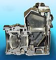
- Nomination Dresden, A half camera --Kolossos 10:43, 1 July 2007 (UTC)
- Decline Size is <2MP, it is blurry and crudely cut out. --Florian Prischl 21:12, 1 July 2007 (UTC)
|
|
- Nomination Erfurt Anger, Germany --Kolossos 10:43, 1 July 2007 (UTC)
- Decline No clear subject, convoluted composition. --Florian Prischl 21:21, 1 July 2007 (UTC)
|
|
- Nomination Eurasian Bullfinch. –Dilaudid 08:08, 1 July 2007 (UTC)
- Decline Size is borderline, heavy artifacts. --Florian Prischl 21:21, 1 July 2007 (UTC)
|
|
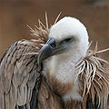
- Nomination Griffon vulture. –Dilaudid 08:17, 1 July 2007 (UTC)
- Decline Size is <2MP. --Florian Prischl 21:21, 1 July 2007 (UTC)
|
|
- Nomination Mute swan with cygnets. --Eva K. Message 09:48, 1 July 2007 (UTC)
- Decline Out of focus, the angle does not show the swan well. --Florian Prischl 21:21, 1 July 2007 (UTC)
|
|
- Nomination Houses in Cacela Velha (Portugal) -- MJJR 21:13, 28 June 2007 (UTC)
- Decline I would have supported this picture, for its composition, if it were not for the presence of the cars and the unfortunate time of the day, with these harsh shadows. Please move it to CR if you want other opinions. - Alvesgaspar 22:17, 29 June 2007 (UTC)*I agree with you. Also, it is tilted to the right, which makes the row appear as if it collapses to the right. --Florian Prischl 21:30, 1 July 2007 (UTC)
|
|
- Nomination Wild Petunia (Ruellia caroliniensis)--Digon3 talk 17:02, 28 June 2007 (UTC)
- Promotion No one else is commenting, so I will. It's a little low on the DoF, but it's technically excellent. -- Ram-Man 13:44, 1 July 2007 (UTC)
|
|
- Nomination I had already nominated it, but it was rejected because it needed to be rotated. Now it should be fine. Alessio Damato 18:17, 29 June 2007 (UTC)
- Promotion It is too. The birds are a nice detail. –Dilaudid 07:57, 1 July 2007 (UTC)
|
|
- Nomination Euchroea- auripimenta- on-passiflora --Makro Freak 16:02, 29 June 2007 (UTC)
- Promotion The head suffers from minor motion blur but otherwise – wow. –Dilaudid 07:57, 1 July 2007 (UTC)
|
|
- Nomination Oxysternon- conspicillatum --Makro Freak 16:02, 29 June 2007 (UTC)
- Promotion Makro Freak style. –Dilaudid 07:57, 1 July 2007 (UTC)
|
|
- Nomination The Tour Pons de l'Orme, Montmajour Abbey near Arles, France -- MJJR 20:59, 25 June 2007 (UTC)
- Decline i find it has a lot of empty space on the top, also the birds are a bit anoying ,minimally blury. so i think i would promote a bit croped version. a second opinion?-LadyofHats 14:38, 27 June 2007 (UTC) Composition. Also the tower doesn't seem quite straight. –Dilaudid 08:15, 1 July 2007 (UTC)
|
|
- Nomination Hydrangea macrophylla -- MJJR 20:15, 25 June 2007 (UTC)
- Promotion Quality Image! --Simonizer 14:10, 27 June 2007 (UTC) *You should nominate this at FPC. --Digon3 talk 20:10, 27 June 2007 (UTC) ** The crop is not nice --Makro Freak 17:41, 30 June 2007 (UTC)
|
}}
|
- Nomination Church of Santa Maria do Castelo, Tavira (Portugal) -- MJJR 20:51, 27 June 2007 (UTC)
- Promotion Is a tad underexposed and could be post-processed, but the highlights were not blown so it's good enough for a QI. -- Ram-Man 13:40, 29 June 2007 (UTC)
|
|
- Nomination Domestic Cat (Felis catus) -- Scrumshus 18:36, 27 June 2007 (UTC)
- Decline Cropped away parts of the ears and paws, wich results in somewhat strange composition. --LC-de 15:32, 29 June 2007 (UTC)
|
|
- Nomination A purple Iris flower -- Penubag 07:08, 27 June 2007 (UTC)
- Promotion A borderline case: noisy, but not too distracting at 2MP. -- Ram-Man 12:32, 29 June 2007 (UTC)
|
|
- Nomination Hercules tower in A Coruña (Galicia, Spain) -- Alessio Damato 16:11, 27 June 2007 (UTC)
- Decline The building is tilted and needs correction before it can be promoted. -- Ram-Man 13:36, 29 June 2007 (UTC)
|
|
- Nomination a genus of herbivorous ceratopsian dinosaur from the Cretaceous Period.-- LadyofHats 10:40, 22 June 2007 (UTC)
- Promotion Seems good enough for a QI to me. -- Ram-Man 13:28, 29 June 2007 (UTC)
|
|
- Nomination a genus of chasmosaurine ceratopsid dinosaur from the Late Cretaceous Period of western North America.-- LadyofHats 10:40, 22 June 2007 (UTC)
- Promotion I see nothing in this image that would cause it to not be a QI. -- Ram-Man 13:28, 29 June 2007 (UTC)
|
|
- Nomination The old castle of Tavira (Portugal) -- MJJR 20:51, 27 June 2007 (UTC)
- Promotion I like the composition, technical quality good enough for QI -- Klaus with K 18:05, 28 June 2007 (UTC)
|
|
- Nomination cistern inside the San Anton Castle in A Coruña, Galicia, Spain. Rendered HDR, to be able to show the huge dynamics of the view Alessio Damato 13:45, 26 June 2007 (UTC)
- Decline The exposure bracketed frames have alignment problems (-> ghosting), plus the exposure range could have been wider. --Dschwen 21:24, 28 June 2007 (UTC)
|
|
- Nomination Romanian countryside in the Suceava region --Alessio Damato 19:21, 25 June 2007 (UTC)
- Decline overexposed.. still impressive-LadyofHats 14:41, 27 June 2007 (UTC);
 Question: just to learn, can I know where I can see it's overexposed? it's bright, but there are no bright white spots (i.e. burnt parts), as I would expect from an overexposed pictures. Thanks Alessio Damato 16:05, 27 June 2007 (UTC) Question: just to learn, can I know where I can see it's overexposed? it's bright, but there are no bright white spots (i.e. burnt parts), as I would expect from an overexposed pictures. Thanks Alessio Damato 16:05, 27 June 2007 (UTC)  Info: get yourself a copy of the free photo-editing programme gimp, several of the colour-modifying commands show you a histogram in the preview - in your case (as often), the blue channel for the sky clips (would have values >255 if it were possible} -- Klaus with K 16:32, 27 June 2007 (UTC)- and in this case is visible without any program, like in the window of the house, the flowers and ever the clouds. it doesnt need to be white to know that an image is overxposed. normally you can recognise it when huge areas end being of one single color.-LadyofHats 10:11, 28 June 2007 (UTC) Thanks Alessio Damato 17:11, 28 June 2007 (UTC) Info: get yourself a copy of the free photo-editing programme gimp, several of the colour-modifying commands show you a histogram in the preview - in your case (as often), the blue channel for the sky clips (would have values >255 if it were possible} -- Klaus with K 16:32, 27 June 2007 (UTC)- and in this case is visible without any program, like in the window of the house, the flowers and ever the clouds. it doesnt need to be white to know that an image is overxposed. normally you can recognise it when huge areas end being of one single color.-LadyofHats 10:11, 28 June 2007 (UTC) Thanks Alessio Damato 17:11, 28 June 2007 (UTC)
|
|
- Nomination A lion-tailed macaque --Chris_huh 11:36, 26 June 2007 (UTC)
- Decline blury-LadyofHats 14:59, 27 June 2007 (UTC)
|
|
- Nomination Cap Blanc Nez in northern France --Chris_huh 11:36, 26 June 2007 (UTC)
- Decline Very beautiful Image, but to much noise for QI. --Simonizer 12:59, 27 June 2007 (UTC)
|
|
- Nomination Camomile Colza and Rainbow --Simonizer 21:49, 25 June 2007 (UTC)
- Promotion nice compotition-LadyofHats 14:38, 27 June 2007 (UTC)
|
|
- Nomination Montmajour Abbey near Arles, France -- MJJR 20:59, 25 June 2007 (UTC)
- Promotion same as the one before i think this one has a lot of empry space on the top , and would look better croped. but still this one is good enough to be promoted. LadyofHats 14:38, 27 June 2007 (UTC)
|
|
- Nomination Montmajour Abbey near Arles, France -- MJJR 20:59, 25 June 2007 (UTC)
- Promotion in this case the empty space gives it a bit of character, but still maybe a bit less would be better-LadyofHats 14:38, 27 June 2007 (UTC)
|
|
Papaver hybridum LC0047.jpg
- Nomination Papaver hybridum --LC-de 19:19, 25 June 2007 (UTC)
- Decline it is such a nice picture, but that plant on the front (the one out of focus) it is just so distracting i am tempted to decline it. second opinion?-LadyofHats 14:41, 27 June 2007 (UTC)
I feel the same way. I like this picture very much and i even would have nominate it for FP. Its a pitty that there is this blurry plant in the foreground. Thats sadly a reason to decline --Simonizer 11:28, 28 June 2007 (UTC)
|
|
- Nomination The War Memorial Tower in Wanganui, New Zealand. –Dilaudid 19:12, 25 June 2007 (UTC)
- Decline
 Comment camera is slightly unsharp+colour fringing at the image edge (see QIC talk page) --Klaus with K 19:33, 25 June 2007 (UTC)- agree, the image is blury and has color aberrations on the top of the tower-LadyofHats 14:53, 27 June 2007 (UTC) Comment camera is slightly unsharp+colour fringing at the image edge (see QIC talk page) --Klaus with K 19:33, 25 June 2007 (UTC)- agree, the image is blury and has color aberrations on the top of the tower-LadyofHats 14:53, 27 June 2007 (UTC)
|
|
- Nomination Fountains Abbey ruins in Yorkshire -- Klaus with K 16:27, 25 June 2007 (UTC)
- Promotion minimal noise and blury in full view. reasonable for QI-LadyofHats 14:53, 27 June 2007 (UTC)
|
|
- Nomination parts of a mature flower.-- LadyofHats 10:40, 22 June 2007 (UTC)
- Promotion Very illustrative --Simonizer 14:13, 27 June 2007 (UTC)
|
|
- Nomination Female black redstart (Phoenicurus ochruros) --MichaD | Michael Apel 15:23, 25 June 2007 (UTC)
- Promotion i really like it-LadyofHats 15:13, 26 June 2007 (UTC)
|
|


